ChemoMetec NucleoCounter NC-3000 FlexiCyte User manual

NucleoCounter
NC-3000™
Quick Guide
®

Table of contents
Setting up the FlexiCyte Protocol 2
Editing Image Capture and Analysis Parameters 3
Optimizing Exposure Time 4
Compensation for Spectral Overlap 6
Creating and Modifying Graphs 8
Gating and Data Analysis 9
•
Polygons
9
•
Quadrants
9
•
Markers
10
•
Table plots
12
Identifying the Sub-Population in the Image Window 13
Gating Cell Populations for Inclusion/Exclusion
in Analysis 13
Generic Gate 14
Exporting Data to Spreadsheets 15
Exporting Data to Other Software 16
Exporting Graphics 16
PDF reports 17
1
2
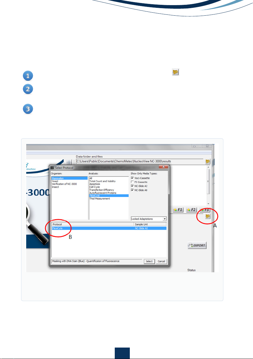
Setting up the FlexiCyte Protocol
Open the ‘Select Protocol’ window opened with the (Fig. 1A)
Select Organism: Mammalian, and Analysis: FlexiCyte, and Media Type:
NC-Slide A2.
Select the FlexiCyte protocol for setting up a new FlexiCyte protocol (Fig.
1B), or select the protocol that should be modified.
Figure 1.
Open ‘Select Protocol window (A), and select the FlexiCyte proto-
col (B).
3
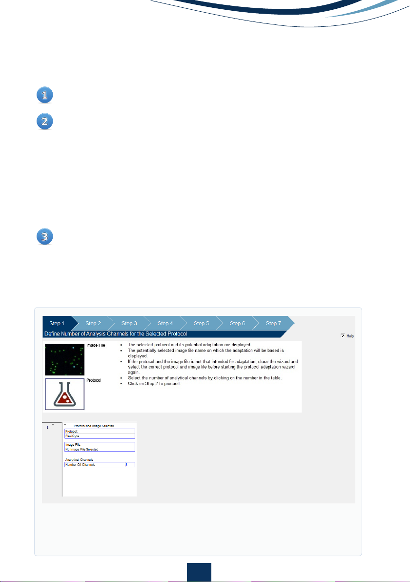
Optional: If a sample has already been run, the wizard can be opened by right
clicking the image file name, and generic data analysis can be set up (See
Template Setup).
Figure 2.
Protocol Adaption Wizard allows the user to define protocols by adjusting
the FlexiCyte™ parameters as described in the help section.
Editing Image Capture and Analysis Parameters
Open ‘Protocol Adaption Wizard’ (Fig. 2) located under ‘Tools’ on the
main menu bar.
Follow the on-screen help to select:
• The number of analytical channels (see fig. 3 for the available
channels)
• Masking method
• Light sources (LEDs)
• Exposure times
• Emission filters
• Minimum number of cells to analyze
• Whether to include or exclude aggregated cells
A new title must be given to any adapted protocols.
4
Optimizing signal acquisition can easily be performed on the NucleoCounter®
NC-3000TM by adjusting the exposure time in a manner similar to that used in
photography. If the image is under-exposed, it will be darker and much of the
finer detail may not be seen. Similarly, if it is over-exposed the pixels will become
saturated and information will also be lost.
Optimizing the exposure time in the NC-3000TM needs to be determined empirically
for the initial experiment but, once determined, the settings can be applied to
all the following samples. That said, the default setting (200 milliseconds for
LED(365) and LED(405), and 1000 milliseconds for LED(475), LED(530) and
LED(630)) will fit most applications and optimization of exposure time may not
be required.
As an example GFP, coupled to a highly expressed protein, has a significant
chance of being over-exposed with the default of 1000 milliseconds. However
most fluorochrome coupled antibodies bound to an expressed protein will be
appropriately exposed with 1000 milliseconds.
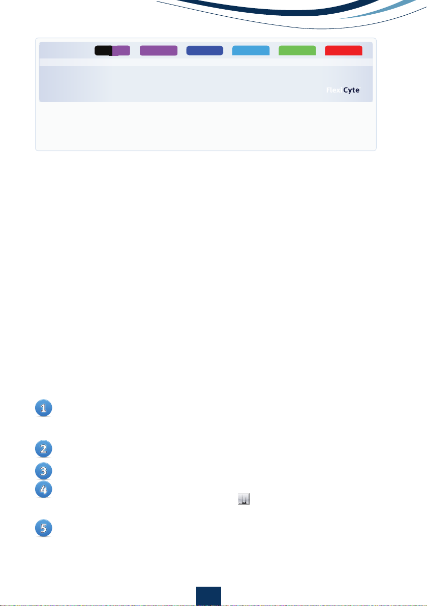
Optimising Exposure Time
Figure 3.
A full list of possible LED/Emission filter combinations.
The denotation of emission filter as e.g. Em530/15 means a bandpass filter
that allows light of wavelength 530nm ± 15nm (515nm - 545nm) to pass.
Blue LED Green LED Red LED
Darkfield / Ex365
Light source
Violet LED
UV LED
Ex365 Ex405 Ex475 Ex530 Ex630
Available emission filters Em430/20
Em470/55
Em475/15
Em560/35
Em675/75
Em630LP
Em740/60
- / Em470/55 Em475/15
Em530/15
Em560/35
Em560/35
Em580/25
Em675/75
Em675/75
Em630LP
Em740/60
Em740/60
UV
(Couterstain)
Darkfield
Insert a sample stained with a single fluorophore of interest and masking
stain (DAPI or Hoechst 33342) if flourescent masking is chosen into the
NC-3000.
Set the exposure time to be evaluated in ‘Protocol Adaption Wizard’ (See
section: editing Image Capture and Analysis Parameters).
Run the sample using the protocol with the adjusted exposure time.
The data will automatically open in ‘Plot Manager’. Add a histogram to
data by clicking on the histogram icon on the left-hand side of the
data row.
Double-click on the small histogram to open the large histogram in
editing mode. Change the x-axis to the appropriate channel and the
parameter to ‘Max Intensity’. This will display the signal intensity for the
most intense pixel/cell rather than average intensity for the area defined
as a cell when the scale is set to ‘Intensity’.
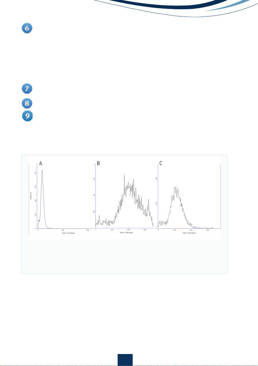
To evaluate if the exposure time for the channel is appropriate for a particular
channel, examine the distribution of the signal in the histogram. The
NC-3000TM is based on 16-bit imaging that allows acquisition of signals
from approx. 0 - 65,500. If the image is under-exposed ‘normal distribution’
curve may rest against the y-axis and lower intensity events will not be
acquired (Fig 4A). If the image is over-exposed, the maximum intensity
values will be close to 65,500 and a shoulder may be seen on the ‘normal
distribution’ curve (Fig 4B).
If required, adjust the exposure time for your sample as appropriate and
repeat step 2 - 6.
Step 2 - 7 should then be repeated for all channels used in the final assay.
Once the optimal exposure time has been determined for the individual
channels, a final protocol with optimized exposure times for all the channels
is saved in the ‘Protocol Adaption Wizard’.
5
Figure 4.
Max intensity histograms for A) under-exposed image, B) over-
exposed image with a shoulder indicating saturated pixels and C) an
image with correct exposure. Note the smaller scale on the under-exposed
image is different so that the peak can be more readily visualized.
6
Load a sample labeled only with a single fluorophore of interest and
masking stain (DAPI or Hoechst 33342) if flourescent masking is chosen.
Run the sample using the desired FlexiCyteTM protocol.
In Plot Manager, open a new scatter plot by clicking on the scatter plot
icon on the left-hand side of the data row.
Compensation for Spectral Overlap
Even though fluorophores are designated a particular color, they emit light over
a range of wavelengths. The color associated with a particular fluorophore
refers to the wavelength where it has maximum fluorescence. However, the
wavelengths where it has weaker emission may spill over into a neighboring
channel giving a false increase in signal in this channel. For example, green
fluorescent protein (GFP) mainly emits fluorescence in the green spectrum that
is usually detected in a green channel. However, GFP also emits a small amount
of fluorescence in the orange spectrum that can be weakly detected in an
orange channel. To compensate for this fluorescent spillover into neighboring
channels, a compensation factor can be set for each fluorophore and channel.
Guidelines for approximate compensation factors to be applied for commonly
used fluorophores is listed in the ‘User Adaptable Protocols’ application note,
but the exact value should be determined as described below.
Double-click the small scatter plot to open the large scatter plot in editing
mode. Change the x-axis to the colour of the fluorophore and the y-axis
to the colour of the neighbouring channel. The axis settings for both axis
should be ‘Linear’ and ‘Intensity’. Click ‘OK’. Tip: change the y-axis range
to cover a larger, lower range so that the cell population is centred on the
y-axis.
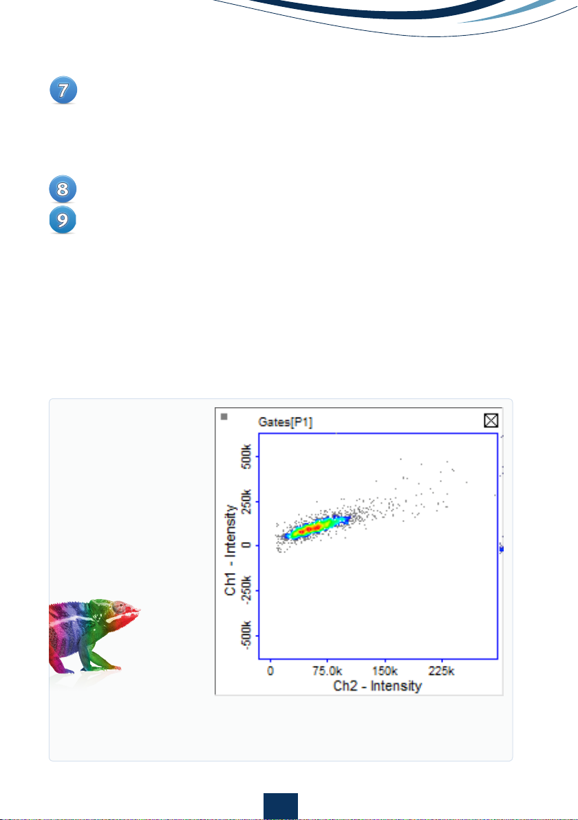
If there is spillover of fluorescence between the channels, the cell
population will be placed diagonally across the graph area (Fig 5). If there
is no spillover, the cell population will be placed horizontally across the
graph area (Fig 6A).
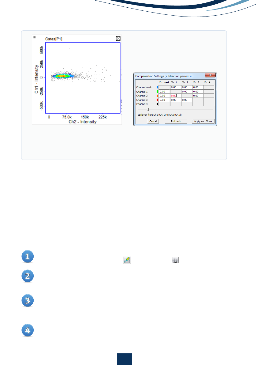
Open the compensation matrix (Fig 6B) in Plot Manager by clicking on the
icon on the left-hand side of the data row.
7
Enter an estimated compensation factor into the matrix box associated
with the two channels of interest and click ‘Preview’ or use the scale bar
for live updated adjustments. Inspect the cell population to ascertain that
cell population is spread horizontally across the graph area. If the compen-
sation factor is incorrect, click ‘Roll back’, enter a new value and inspect the
cell population again. Repeat this procedure until the correct compensation
factor is ascertained and click ‘Apply’.
Repeat step 1-7 for each individual fluorophore.
If multiple samples have been analyzed, enter the row number of the sample
with the corrected compensation factor into the ‘Master Row’ box situated
in the top left-hand corner of Plot Manager and click ‘Apply’. This will replicate
the compensation in all other samples selected in Plot Manager.
Tip: after the final compensation has been set, a row with analysis including
all compensation can be used as master row in the setup of the protocol
(see Template Setup).
Figure 5.
Scatter plot of cells expressing GFP showing spillover of green
fluorescence into the orange channel. An increase in orange fluorescence is
seen as green fluorescence increases.
8
Creating and Modifying Graphs
Default graphs representing each of the channels measured in a particular analysis
or graphs defined by the master in the protocol are automatically opened in Plot
Manager. However, these graphs may be modified for better viewing by changing
the axis scale or parameter. Adding new scatter plots may be required for data
analysis.
Double-click on the appropriate icon on the left-hand side of the data row
representing either a scatter plot or a histogram .
A small plot with default settings will have been added to the corresponding
data row in Plot Manager. Double-click on the small plot to open it in editing
mode.
Axis scale and parameters can be changed and only those parameters
available for that particular analysis will be available from the drop down
menu. Axis scale can be returned to default setting by leaving fields blank
or entering the number in the gray fields immediately below.
Click ‘OK’ to save changes and close the large graph.
Figure 6.
A) Scatter plot showing GFP fluorescence in the green and orange
channel after compensation. Note, no increase in orange fluorescence
is seen as green fluorescence increases. B) Compensation matrix adjusted
for 0.8% signal spillover from the GFP into the orange channel.
A)
B)
9
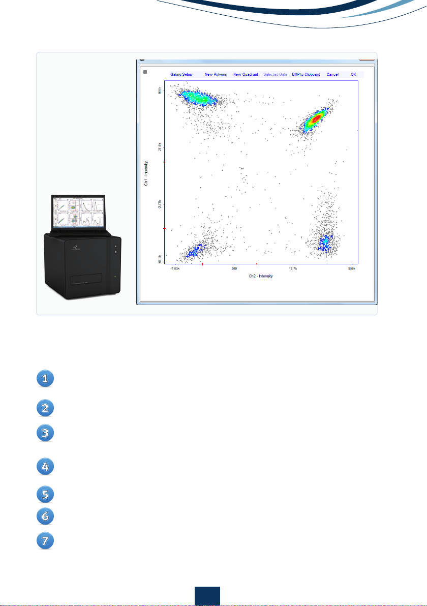
Gating and Data Analysis
Data analysis will often require that debris or sub-populations of cells are
identified and removed and statistics for the different populations gathered.
Sub-populations of cells can be marked by either quadrants or polygons in scatter
plots and markers in histograms.
•
Polygons
Open a large scatter plot in editing mode by double-clicking on the small
graph.
Select ‘New Polygon’ (Fig. 7).
Place points encircling the population of interest by clicking in the graph
area. Clicking in the grey area outside the scatter plot will remove the last
point added. Click on the first point created to close polygon.
Polygons can also be copied between rows by right-clicking on a selected
red polygon, or use the ‘Selected Gate’ menu point and copy to clipboard.
The plot to which the polygon is to be added should then be opened by
double-clicking followed by right-clicking and selecting ‘Paste Gate’.
•
Quadrants
Open a large scatter plot in editing mode by double-clicking on the small
graph.
Select ‘New Quadrant’ (Fig. 7).
Click at the position in the scatter plot where the centre of the quadrant
should be placed.
While the quadrants are highlighted in red, click the quadrant again. Red
boxes will appear indicating that the quadrant is in editing mode. In this
mode, the centre of the quadrant can be re-positioned and the angle of
the quadrant boundaries can be adjusted.
Quadrants can also be copied between rows by right-clicking on a
selected red Quadrant, or use the ‘Selected Gate’ menu point and copy to
clipboard. The plot to which the quadrant is to be added should then be
opened by double-clicking followed by right-clicking and selecting ‘Paste
Gate’.
10
•
Markers
Markers can be inserted on histograms by clicking on the small histogram
to open the large histogram in editing mode.
Select ‘Create Marker’ and the cursor will change from an arrow to a cross.
Create a marker by clicking on the positions in the histogram where the
markers are to start and finish.
Marker position and length can be adjusted by dragging in the marker
line or in the endpoints of the selected red marker.
Repeat step 2-4 to insert multiple markers into a single histogram.
Click ‘OK’ to save markers.
Markers can also be copied between rows by right-clicking on a select-
ed red marker and selecting ‘Copy Marker’. The histogram to which the
marker is to be added should then be opened by double-clicking followed
by right-clicking and selecting ‘Paste Marker’.
Figure 7.
Large scatter
plot of a FlexiCyte
assay to measure GFP
and RFP transfection.
11
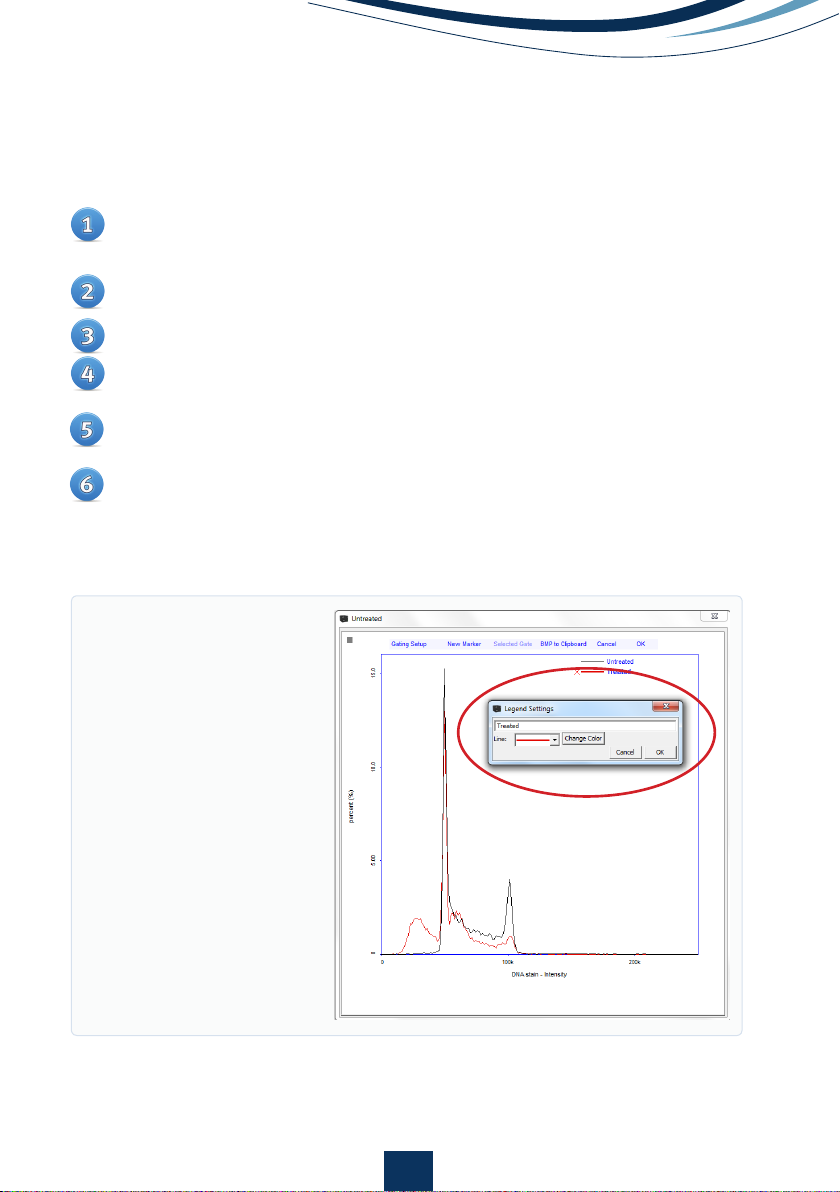
Histograms from multiple analyses can be displayed in a single graph to allow
better visual comparison of the results.
Right-click on the small histogram plot to be copied and select ‘Copy
Histogram’.
Right-click on the small histogram plot to where the histogram is to be
pasted and select ‘Paste Histogram’.
Repeat step 1-2 to insert overlay multiple histograms.
Double-click on the small histogram plot containing histogram overlay to
open it in editing mode.
A new text input line will now be present and individual histograms can
be colored and named by clicking this line (Fig. 8).
A ‘red cross’ button will also be present in the large histogram plot (Fig.
8). By clicking on the ‘red cross’ button, the associated histogram will be
removed from the overlay.
Creating an Overlay of Histograms
Figure 8.
Large histogram
plot displaying an overlay
of a standard cell cycle
profile (red line) on a histo-
gram of a cell cycle showing
DNA fragmentation (black
solid line). Buttons for
removing histograms and a
pop-up window for modi-
fying line color and form
along with text input fields
encircled in red.
12
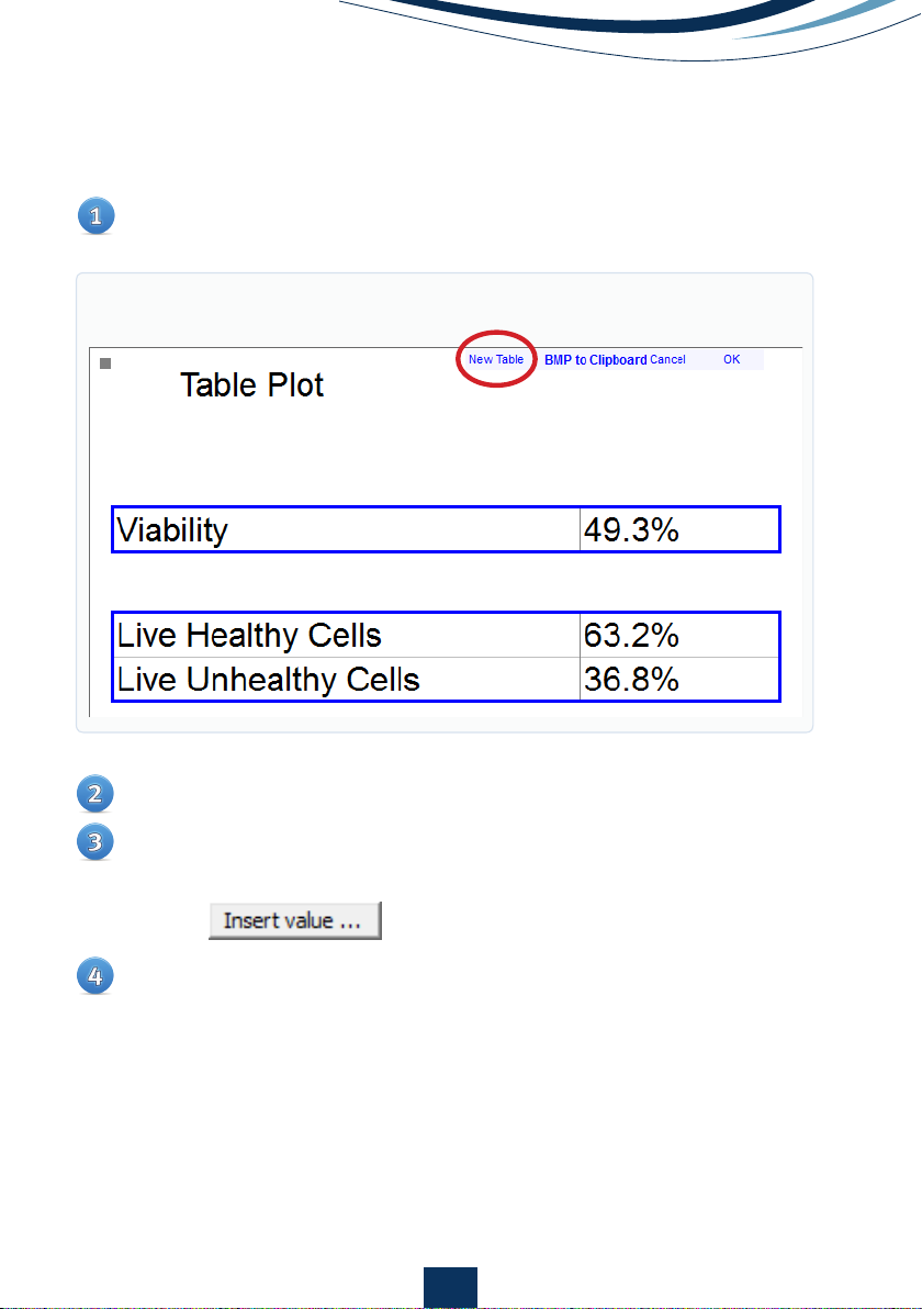
•
Table plots
Add and place a new table in your table plot. (Fig. 9)
To fill in text, simply click in the table and write your text
To fill in a formula, right-click a table and fill in your calculation
a. To select a value from a Quadrant, Polygon or Marker, use the
button
To format cells with text colors and other settings, right click and select
“Format Cell …”
Figure 9.

13
Identifying the Sub-Population in
the Image Window
One of the advantages of image cytometry is that cells defined in a particular
sub-population can be identified in the image acquired for analysis. This is
done when the image file for the analysis is loaded in the main window and
sub-populations have been defined by polygons, quadrants or markers.
Open the desired graph containing the polygon, quadrant or marker
identifying the sub-population.
Select the sub-population by clicking on the gating lines so that it
appears red.
Right-click and choose the appropriate option, for example ‘Add cells
inside/outside gate to image overlay’.
The events in a scatter plot will be highlighted and the corresponding
cells in the image will be marked by colored boxes.
To de-select the cells in the image, right-click in the plot area and select
‘Delete Image Overlay’ or right-click on the image overlay button in the
image window and select ‘Delete Image Overlay’.
Gating Cell Populations for Inclusion/
Exclusion in Analysis
Particular sub-populations of observed events can be either included or
excluded in the data analysis using gating options. The sub-populations are
those defined by the polygons, quadrants and markers.
14
Generic Gate
Once compensation factors, quadrants, polygons, markers and gating options
have been defined for a sample, these settings can easily be applied to all
future analyses acquired with a specific protocol.
Check the box associated with the sub-population of interest and the
desired action such as ‘Include’ or ‘Exclude’.
Click ‘Apply’ to show the effect of the gating chosen and ‘OK’ to save. If
gating is not required, check the ‘Disable’ box followed by ‘Okay’.
Note: if multiple gates have been selected for inclusion or exclusion, they can
be combined by either Union or Intersection of the populations.
• Union: this option is available when two gates have been set to either
Include or Exclude.
Selecting this option results in display of the sum of all events
displayed for the two gates (included or excluded).
• Intersection: This option is available when two gates have been set to
either Include or Exclude.
Selecting this option results in display of the events displayed for both
of the two gates (included or excluded).
Double-click on the small graph to be analyzed to open the corresponding
larger graph in editing mode.
Click the ‘Gating Setup’ in the upper left corner to open a list of gating
options available for that particular analysis. Gate options are denoted
as ‘P’ for polygon, ‘Q’ for quadrant and ‘M’ for markers followed by a num-
ber indicating the order of creation. The most commonly-used functions
listed are to ‘Include’ or ‘Exclude’ sub-populations but more advanced
settings may also be listed.
15
Exporting Data to Spreadsheets
Data from post-processing can be exported in *.csv format (compatible
with software such as Excel) by clicking on the button at the top of Plot
Manager.
All the data from each analysis and for each marker, polygon and
quadrant will appear in a new pop-up window.
The data to be exported can be user-defined by right-clicking at the table
heading and selecting the parameters of interest for each gate.
Select the table and right-click on it to copy it over to third-party spread
sheet software for further analysis, if desired.
Save the row with all adjusted compensations, markers, polygons,
quadrants and gatings by clicking on the button in the row dialog.
Right-click the file in the file list that represents the data just saved and
select ‘Start Protocol Adaptation Wizard’.
In the wizard, skip directly to the step ‘Select and setup a master file’, the
second last step.
Verify that all compensations, markers, polygons, quadrants and gatings
are as desired.
Click on the row dialog to select the file as a master file.
Choose ‘Save’ to overwrite/update the existing protocol, or ‘Save as’ to
create a new protocol.
Optional: Protocols can be locked to hinder future changes to the protocol
(locked protocols must be un-locked to be changed).
16
Exporting Data to Other Software
Select the file containing the data to be exported.
In the ‘File’ menu select ‘Export Data’.
A new window will open allowing you to choose the format to be exported,
which parameters are to be exported and the location where the file is to
be saved.
Select the appropriate parameters and click on ‘Export’ to save the files
to the desired location.
Data can be exported in ‘*.acs’ or ‘*.fcs’ formats which are compatible with
most third-party cytometry analysis packages.
Tip: multiple files can be selected in the file browser and can be batch exported
by right-clicking. Note that only files acquired with the same protocol can be
batch exported together.
Exporting Graphics
All graphs along with cell images can be copied by either right-clicking on
the cell image and selecting ‘Copy BMP to clipboard’ or for histograms and
scatter plots, by clicking ‘BMP to Clipboard’. The image can then be pasted
into another document or presentation.
17
PDF reports
Right-click on file to create a PDF report
Select the parameters to be visible on the report and the properties of the
parameters
Optional: preview your result
Save and/or print your report to the default printer
Figure 10
Figure 12
Figure 11
18
Tip: Batch exports can be done from the NucleoView™ File Browser.
ChemoMetec A/S
Gydevang 43
DK-3450 Allerod
Denmark
Phone(+45) 48 13 10 20
Fax (+45) 48 13 10 21
Mail contact@chemometec.com
Web www.chemometec.com
991-3004A ver. 1.2016
Additional Resources
• Documentation
• SDS
• Certificates of analysis
• Application notes
• Articles
• Videos etc.
Disclaimer Notices
The material in this document and referred documents is for information only and is subject to change without notice.
While reasonable efforts have been made in preparation of these documents to assure their accuracy, ChemoMetec A/S
assumes no liability resulting from errors or omissions in these documents, or from the use of the information contained
herein.
ChemoMetec A/S reserves the right to make changes in the product design without reservation and without notification
to its users.
Copyright Notices
Copyright © ChemoMetec A/S 2012. All rights reserved. No part of this publication and referred documents may be re-
produced, stored in a retrieval system, or transmitted in any form or by any means, electronic, mechanical, photocopying,
recording or otherwise, without the prior written consent of ChemoMetec A/S, Gydevang 43, DK-3450 Allerod, Denmark.
ChemoMetec and NucleoCounter are registered trademarks owned by ChemoMetec A/S.
NC-Slides and NucleoView are trademarks of ChemoMetec A/S.
All other trademarks are the property of their respective owners.
Consumables:
Item no. Description
942-0003 NC-Slides A8™
942-0001 NC-Slides A2™
910-3012 Solution 12
910-3015 Solution 15
Go to www.chemometec.com to find:
Table of contents
Other ChemoMetec Medical Equipment manuals

Popular Medical Equipment manuals by other brands


Otto Bock
Otto Bock 50R230 Smartspine TLSO Instructions for use

InfuSystem
InfuSystem CardinalHealth SVED Patient Quick Reference Guide

dynarex
dynarex D500 user manual

Welch Allyn
Welch Allyn Connex Spot Monitor Directions for use

Seiler
Seiler Evolution xR6 installation instructions

Ossur
Ossur Icelock Clutch 211 Instructions for use