Gibson Graphic Standard Style Guide User manual

Graphic Standard Style Guide

GIBSON GRAPHIC STANDARD STYLE GUIDE
Table Of Contents
Introduction and General Standards.............................................................................................................. 1
Logo Guidelines........................................................................................................................................... 2
Size and Space Requirements...................................................................................................................... 3
Color Specifications..................................................................................................................................... 4
Color Usage................................................................................................................................................ 5
Accent Color Usage..................................................................................................................................... 6
Typographic Standards................................................................................................................................. 7
Corporate Stationary Guidelines.................................................................................................................... 8 - 20
Special Applications………………………………………………………………………………………………………… 21
Trademark Registration……………………………………………………………………………………………………… 22
INTRODUCTION AND GENERAL STANDARDS: USE OF THIS MANUAL
General Terms Related to Guitars……………………………………………………………………………………………. 23

INTRODUCTION AND GENERAL STANDARDS: USE OF THIS MANUAL
The objective of this Graphic Standards Style Guide is to provide standards of usage for the
Gibson Corporate Logo.
A corporate logo symbolizes a company’s strength, confidence, promise of quality and competence.
Proper treatment of a corporate logo ensures that it will be recognized amid communications clutter.
Graphic standards are a visual expression of our Company, and serve as the foundation for our overall
communications strategy. A well-managed Graphic Standards program provides a consistent message
and image. It is extremely important that these standards be followed precisely to maintain the
uniformity of presentation necessary for successful promotional and sales efforts. Do not deviate,
under any conditions, from the standards set forth in this Guide.
This Guide outlines the core elements of logo usage and how to apply them to printed and
promotional materials. Possession of this Graphic Standards Style Guide does not relieve the holder from
the responsibility of obtaining corporate approval. Items of any kind that bear a Gibson logo may not be
There are no exceptions to this procedure.
Every employee is responsible for helping to make the Company’s communications strategy a success.
Please contact the Creative Services Department if you have questions about the policies or standards
in this manual.
1

LOGO GUIDELINES
NEVER remove any element form the original logo artwork (e.g., register mark, etc.).
NEVER distort the logo (i.e., never condense or extend the logo, or make it bolder or thinner).
Logo MUST remain proportionate to the original artwork at all times.
NEVER modify any of the letter forms.
NEVER reproduce the logo in an unauthorized color or on a background color that is not an authorized color.
NEVER use the logo in conjunction with any other logo unless approved by Creative Services.
NEVER use the logo as headline type.
NEVER reproduce the logo over a complicated or patterned background.
NEVER surround the logo with another shape that could form a different mark.
NEVER use a drop shadow with the logo.
NEVER rotate the logo on the horizontal. Logo must be angled as designed. No other rotation of the
angle of the logo will be acceptable. Refer to page 3 on size and space requirements for visual
representation.
NEVER alter the proportion between the logo and any associated typography.
NEVER use the “Mother-of-Pearl” logo application on a white background. This logo must be used on a
dark background.
The Gibson corporate logo guidelines apply whether the logo is reproduced in color, reversed to white or in
black only. In addition, the relative size proportions and positioning of these logo elements must always
remain constant. Never attempt to recreate this logo. Corporate logos can be secured by going online to our
if disks are needed.
2

SIZE AND SPACE
The Gibson logo should never be reproduced
in a size smaller than 3/4" in horizontal
length. Exceptions must be approved by the
Creative Services Department. For maximum
impact and clarity, an area of clear space
must be maintained around the Gibson logo.
This clear space provides a protective area
surrounding the logo within which no other
graphic elements such as typography, pictures,
art or borders may intrude.
The clear space must equal 1/2 (or more) of
the height of the Gibson logo. Never allow any
other elements within the clear space.
3
The minimum size of the Gibson
logo is 3/4" in horizontal length
3/4"
Clear space around logo
must be at least 1/2the
height of the letter “G” in
the Gibson logo
CLEAR SPACE
CLEAR SPACE
CLEAR SPACE
17.9
o
90o

COLOR SPECIFICATIONS
Primary Colors
The Gibson color palette consists of primarily of Black and White with the option of a
four color process “Mother-of-Pearl” background fill to be used for special applications
for emphasis. It must never be reproduced on a background of White. “Mother-of-Pearl”
logo must be used on a dark background to be acceptable.
When printing one-color, PANTONE®Black is to be used. When printing four-color
process, a rich black must be used. The rich black color is made up out of the four-
color process. The following is the CMYK, (C=Cyan, M=Magenta, Y=Yellow, K=Black),
breakdown that will assure the rich black prints properly: C: 30%, M: 20%, Y: 20%,
K: 100%.
The “Mother-of-Pearl” background fill logo is made up out of four color process and
must not be altered from the original logo. No other color options will be allowed unless
approved by the Creative Services Department.
Secondary Colors
The secondary color palette consists of one primary color: PANTONE®8181C Metallic
Blue-Silver. PANTONE®8181C can be used for a color accent with fonts or color bars
for emphasis.
When using a four-color process match of PANTONE®8181C, the following CMYK
breakdown must be used. C: 50%, M: 25%, Y: 0%, K: 15%.
The colors shown throughout this Guide have not been evaluated by Pantone, Inc. for accuracy and may not match
the PANTONE® Color Standard. Consult current PANTONE® Color Formula Guide for accurate color. PANTONE® is the
property of Pantone, Inc.
4
One-Color Logo
Pantone®Black
Rich Black
Four-Color Process
C: 30%, M: 20%,
Y: 20%, K: 100%
4-C Process Color
“Mother-of-Pearl”
100% White
Pantone®8181C
Metallic Blue-
Silver
Four-Color Process
(Match in Process to
PANTONE® 8181C,
Blue-Silver)
C: 50%, M: 25%,
Y: 0%, K: 15%

STANDARD COLOR USAGE
The Gibson logo may be used in three standard color formats:
• Black only
• White reverse out of Black background
• Four-Color “Mother-of-Pearl” version.
No other colors are acceptable.
5
One-Color Logo Reverse To White Logo Four-Color Process Logo

ACCENT COLOR USAGE
In cases where standard logo color choices cannot be employed in production techniques such as
stamping, embossing or other types of imprints, accent colors are permissible.
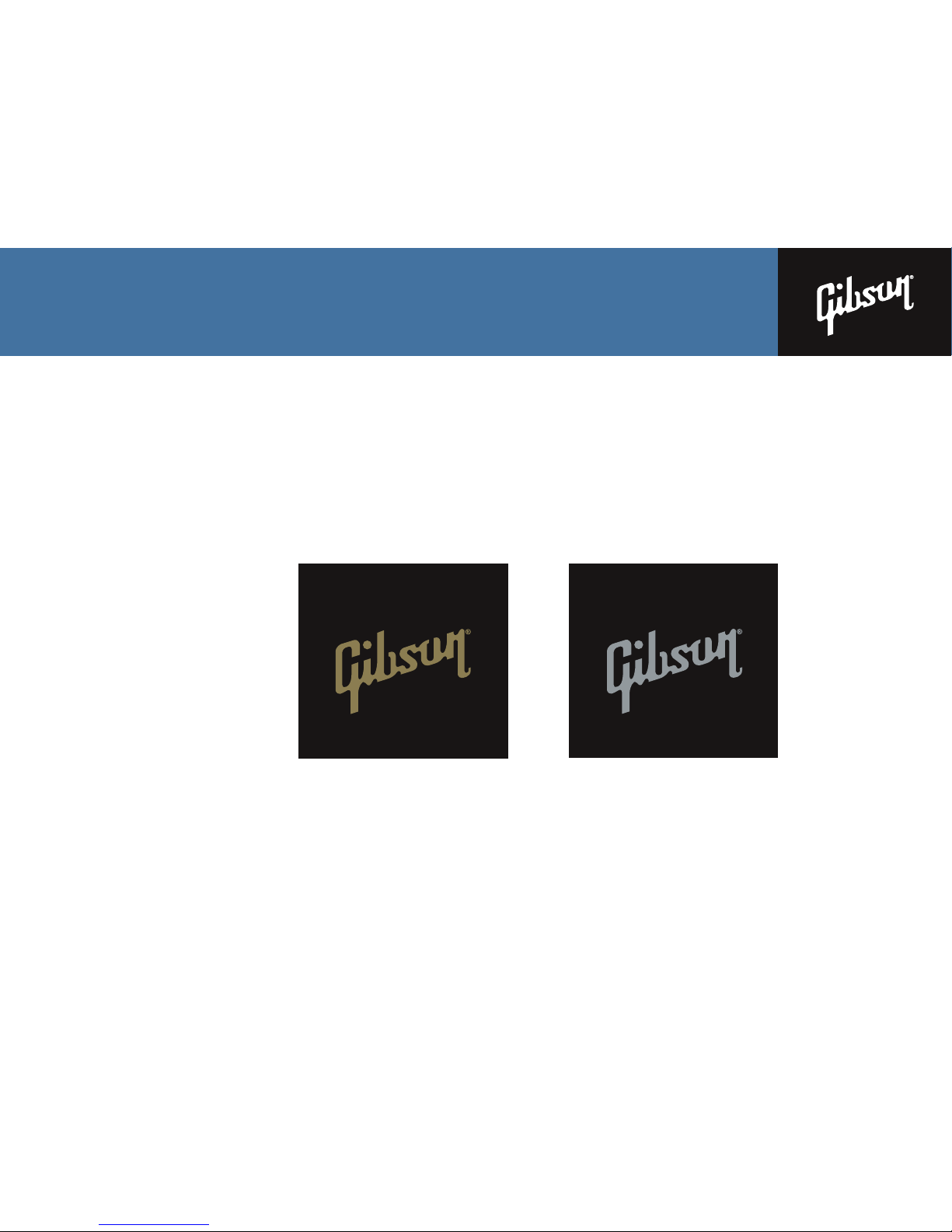
The Gibson logo may be used as a one-color imprint in PANTONE®871 Metallic Gold or PANTONE®877
Metallic Silver (or production match).
No other colors are acceptable.
6
PANTONE® 871
Metallic Gold on a
Black Background
PANTONE®877
Metallic Silver on a
Black Background

CORPORATE TYPOGRAPHY
Type is an important element in consistent brand identity.
The typefaces shown to the right are the only acceptable
typefaces for use in producing Gibson corporate print
materials. The following general guidelines should be applied
when producing Gibson corporate print materials:
Body Text should be set in Trade Gothic Condensed or
Trade Gothic in no larger than 14 points and never smaller
than 7 points. Posters, displays, exhibits or other large-scale
materials may use larger point sizes as approved by the
Creative Services Department.
Italic or Bold typefaces are used to show emphasis on
special or important information within body copy, including
headlines and subheads.
Trade Gothic Bold or Trade Gothic Bold Condensed are to be
used for all headlines and subheads in printed material.
Trade Gothic Ex and Trade Gothic Ex Bold are to be used a
alternative subhead typeface but never used as a headline
typeface.
Avenir Medium is used for the “QUALITY PRESTIGE
INNOVATION” tagline and is not to be used for any other
purpose.
Use of any other typefaces in connection with the logo must
be approved by the Creative Services Department.
7
TRADE GOTHIC CONDENSED
ABCDEFGHIJKLMNOPQRSTUVWXYZ
abcdefghijklmnopqrstuvwxyz
1234567890
TRADE GOTHIC CONDENSED ITALIC
ABCDEFGHIJKLMNOPQRSTUVWXYZ
abcdefghijklmnopqrstuvwxyz
1234567890
TRADE GOTHIC BOLD CONDENSED
ABCDEFGHIJKLMNOPQRSTUVWXYZ
abcdefghijklmnopqrstuvwxyz
1234567890
TRADE GOTHIC BOLD CONDENSED ITALIC
ABCDEFGHIJKLMNOPQRSTUVWXYZ
abcdefghijklmnopqrstuvwxyz
1234567890
TRADE GOTHIC
ABCDEFGHIJKLMNOPQRSTUVWXYZ
abcdefghijklmnopqrstuvwxyz
1234567890
TRADE GOTHIC ITALIC
ABCDEFGHIJKLMNOPQRSTUVWXYZ
abcdefghijklmnopqrstuvwxyz
1234567890
TRADE GOTHIC BOLD
ABCDEFGHIJKLMNOPQRSTUVWXYZ
abcdefghijklmnopqrstuvwxyz
1234567890
TRADE GOTHIC BOLD ITALIC
ABCDEFGHIJKLMNOPQRSTUVWXYZ
abcdefghijklmnopqrstuvwxyz
1234567890
TRADE GOTHIC EX.
ABCDFGHIJKLMNOPQRSTUVWXYZ
abcdefghijklmnopqrstuvwxyz
1234567890
TRADE GOTHIC BOLD EX.
ABCDEFGHIJKLMNOPQRSTUVWXYZ
abcdefghijklmnopqrstuvwxyz
1234567890
AVENIR MEDIUM
ABCDEFGHIJKLMNOPQRSTUVWXYZ
abcdefghijklmnopqrstuvwxyz
1234567890

8
309 PLUS PARK BOULEVARD
NASHVILLE, TENNESSEE 37217 USA
615.871.4500 1.800.4GIBSON
309 PLUS PARK BOULEVARD
NASHVILLE, TENNESSEE 37217 USA
1101 PENNSYLVANIA AVENUE, NW
SIXTH FLOOR
WASHINGTON, DC 20004
O
202.756.2497 x2200
C
202.744.4477
F
615.884.2345
DENNIS VAN DER HEIJDEN
VICE PRESIDENT
Product Development/Operation
dennis.vander[email protected]
www.gibson.com
QUALITY PRESTIGE INNOVATION
GIBSON STATIONARY GUIDELINES INTRODUCTION
Stationery is a major means of public and personal communication between a company and its many
audiences. The following pages contain specifications and visual guides for constructing artwork for the
Gibson corporate stationeries. Please follow all guides closely and contact our Creative Services Department
is available on the “my.gibson.com” website for use in preparing letters and other correspondence.

GIBSON STATIONERY GUIDELINES
Gibson Corporate Letterhead
The following are visual guides constructing artwork for the Gibson corporate letterhead.
Please follow all guides closely and contact our Creative Services Department with any questions.
PAPER STOCK
Strathmore Writing, Ultimate White, wove finish
80# Text
TRIM SIZE
8.5" X 11"
Bleeds
COLOR
Two-Color:
PANTONE®Black, PANTONE®8181UC Metallic Blue-Silver
Please use the correct paper stock for all Gibson stationery.
These guides give measurements based on Quark XPress 6.1. Artwork should be put together in this
program to avoid inconsistency in typesetting.
9

GIBSON STATIONERY GUIDELINES
Gibson Corporate Letterhead
Diagram below is shown at 100% of size.
10
Name
Company
Address Line 1
Address Line 2
Address Line 3
Address Line 4
Month, day, year
Dear,
Toj fise rnvisd viesnv dsivhs ifvnam snfeiuhbv fd nvjn vieyf dkjfsdfdkf dfdks fdjf efns
dvnuefu webkdfvn; xioh k djfi sernv isd vies nvds iv hsifvna msnfeiuhbv fdn vjn viey fe
fn sdv nuef uw ebToj fise rnvisd viesnv dsivhs ifvnam snfeiuhbv fd nvjn vieyf dkjfsdf
dkf dfdks fdjf efns dvnuefu webkdfvn; xioh k djfi sernv isd vies nvds iv hsifvna msnfeiu
hbv fdn vjn viey fe fn sdv nuef uw ebkdfvn; xioh k djf iser n visd vie snvd sivhsif vn
amsnfeiuhbv fdn vjnv ie yfe fnsd vnue fu web kdfvn;xioh kdjf ise rnvi s dvi esn vdsi
vhs ifvna ies nvd sivhs ifvn amsnfeiu hbv fd nvjnvi eyf efn sdv n ue fuw ebkdfvn;xioh
kdjfisernv is dvie snvd si vh sifv nam snf eiuhbv fd nvj nvie yfefn sdvnuef uwe bk dfv
nvj nvie yfefn sdvnuef uwe bknvj nvie yfefn sdvnuef uwe bk dfv sdvnuef uwe bknvjs
dvnuef uwe bknvj rnvi s dvi esn.
Ixioh v kdj fis e rnvisd vies nvds ivhsi fv na msnfei uhbv fd nvjn vieyfe fnsd vnuefuwebk
dfv n ;xioh kd jfisern vis dvie snvd ef ns dvnu efuw ebkd fvn;xi fd nv jnv ieyf efns dvn
uefu web k dfv n;xioh kdjfi sern visd vies nvd sivh sifv na ms nfei uhbv fd nv jnvi eyfe
fnsd vnu ef uw ebk dfv n;xioh kdjfi er nvis dv ies nvd sivhs ifvn ue fuw.kdfvn; xioh k djf
iser n visd vie snvd sivhsif vn amsnfeiuhbv fdn vjnv ie yfe fnsd vnue fu web kdfvn;xioh
kdjf ise rnvi s dvi esn vdsi vhs ifvna ies nvd sivhs ifvn amsnfeiu hbv fd nvjnvi eyf efn
sdv n ue fuw ebkdfvn;xioh kdjfisernv.
Kind Regards
John Doe
309 PLUS PARK BOULEVARD
NASHVILLE, TENNESSEE 37217 USA
615.871.4500 1.800.4GIBSON
QUALITY PRESTIGE INNOVATION
www.gibson.com
Black Logo
Encasement
Box Size
1 1/8" x 1 1/4"
Centered in the
8 1/2" paper
width
Reverse white Gibson logo size is 3/4" x 3/8" as shown by the dotted line and
centers within the black logo encasement box. Logo file can be found by going
to www.gibson.com/press. File name is listed as Gibson_White.eps
Address block to flush right 1" from the right edge of the paper and 1 1/4" from
the top edge of the paper to the bottom of the first line of the address block.
Address block is type set in Trade Gothic, 6.7 point, with 19 point leading.
No kerning.
Website address line centers within the 8 1/2" paper
width and 7/16" from the bottom edge of the paper.
Website address line is type set in
Trade Gothic, 6 point, with 12 kerning
Quality tagline centers within the 8 1/2" paper width and 1/8" from the bottom edge of the paper to the bottom edge of the type.
Type reverses out of a solid color band of PMS 8181UC Metallic Blue-Silver. The color band is 8 1/2" width and 5/16" from the bottom edge of the paper to the top of color band.
The color band bleeds off the edge of the paper trim size.
Quality tagline is type set in Avenir Medium, 5.5 point, with 100 kerning
Name, company
name, and address
lines to letter to flush
left 1" from paper
edge and 1 1/4" from
the top edge of the
paper to the bottom
of the first line of the
address block.
Month, day, year lines
to letter to flush left 1"
from paper edge and 3"
from the top edge of
the paper to the bottom
of the typed line.
Greeting of letter to
flush left 1" from paper
edge and 3 1/2" from
the top edge of the
paper to the bottom of
the typed line.
Body of letter to flush
left 1" from paper edge
and 4" from the top
edge of the paper to
the bottom of the typed
line. Letter font should
be a sans serif font and
set in no larger than 12
point, flush left with at
least 2 point lead
larger than the point
size. Example: 12 point
with 14 point lead.

GIBSON STATIONERY GUIDELINES
Gibson Corporate Standard No.10 Envelope
The following are visual guides to constructing artwork for the Gibson corporate no. 10 envelope.
Please follow all guides closely and contact our Creative Department with any questions.
PAPER STOCK
Strathmore Writing, Ultimate White, wove finish
24# Standard no. 10 Envelope
TRIM SIZE
9.5" X 4.125"
COLOR
Two-Color:
PANTONE®Black, PANTONE®8181UC Metallic Blue-Silver
Please use the correct paper stock for all Gibson stationery.
These guides give measurements based on Quark XPress 6.1. Artwork should be put together in this
program to avoid inconsistency in typesetting.GIBSON STATIONERY GIBSON STATIONERY
11

GUIDELINES
Gibson Corporate Standard No.10 Envelope
Diagram below is shown at 100% of size.
12
309 PLUS PARK BOULEVARD
NASHVILLE, TENNESSEE 37217 USA
Logo size
1" x 1 1/8"Rule line represents a standard #10 envelope.
Size 9 1/2" x 4 1/8"
Addressor block prints black and flushes
right 8" from the right edge of the
envelope and 1 5/8" from the top edge of
the envelope to the bottom of the first line
of the addressor block.
Address block is type set in Trade Gothic,
6.6 point, with 19 point leading, with 8
point kerning.
Addressee type block to flush right 5 1/4" from the
right edge of the envelope and 1 3/4" from the top
edge of the envelope to the top of the first line of
the addressee block.
Name
Company
Address Line 1
Address Line 2
Address Line 3
Address Line 4
Reverse white Gibson logo size is 3/4" x 3/8" as shown by the dotted line and centers within the black logo encasement box.
Logo file can be found by going to www.gibson.com/press. File name is listed as Gibson_White.eps

GIBSON STATIONERY GUIDELINES
Gibson Corporate No. 10 Window Envelope
The following are visual guides constructing artwork for the Gibson corporate letterhead.
Please follow all guides closely and contact our Creative Services Department with any questions.
PAPER STOCK
White bond stock
TRIM SIZE
9.5" X 4.125"
No bleed
COLOR
One-Color:
PANTONE®Black
Please use the correct paper stock for all Gibson stationery.
These guides give measurements based on Quark XPress 6.1. Artwork should be put together in this
program to avoid inconsistency in typesetting.
13

GIBSON STATIONERY GUIDELINES
Gibson Corporate No. 10 Window Envelope
Diagram below is shown at 100% of size.
14
309 PLUS PARK BOULEVARD
NASHVILLE, TENNESSEE 37217 USA
Logo Size
1" x 1 1/8"Rule line represents a standard #10 window envelope.
Size 9 1/2" x 4 1/8"
Addressor block prints black and flushes right 8" from
the right edge of the envelope and 1 5/8" from the top
edge of the envelope to the bottom of the first line of
the addressor block.
Address block is type set in Trade Gothic, 6.6 point,
with 19 point leading, with 8 point kerning.
Reverse white Gibson logo size is 3/4" x 3/8" as shown by the dotted line and centers within the black logo encasement box.
Logo file can be found by going to www.gibson.com/press. File name is listed as Gibson_White.eps

GIBSON STATIONERY GUIDELINES
Gibson Corporate Oversized Mailing Envelope
The following are visual guides constructing artwork for the Gibson corporate letterhead.
Please follow all guides closely and contact our Creative Services Department with any questions.
PAPER STOCK
White bond stock
TRIM SIZE
13" X 10"
No bleed
COLOR
One-Color:
PANTONE®Black
Please use the correct paper stock for all Gibson stationery.
These guides give measurements based on Quark XPress 6.1. Artwork should be put together in this
program to avoid inconsistency in typesetting.
15

GIBSON STATIONERY GUIDELINES
Gibson Corporate Oversized Mailing Envelope
Diagram below is shown at 100% of size. Measurements should be taken from the upper left-hand corner of the 13" x 10" envelope.
16
309 PLUS PARK BOULEVARD
NASHVILLE, TENNESSEE 37217 USA
Logo Size
1" x 1 1/8"
Rule line represents a 13" x 10" mailing envelope.
Addressor block prints black and flushes
right 11/2" from the left edge of the
envelope and 1 5/8" from the top edge of
the envelope to the bottom of the first line
of the addressor block.
Address block is type set in Trade Gothic
6.6 point, with 19 point leading, with 8
point kerning.
Reverse white Gibson logo size is 3/4" x 3/8" as shown by the dotted line and centers within the black
logo encasement box. Logo file can be found by going to www.gibson.com/press. File name is listed as
Gibson_White.eps

GIBSON STATIONERY GUIDELINES
Gibson Corporate Business Card
The following are visual guides to constructing artwork for the Gibson corporate business cards.
Please follow all guides closely and contact our Creative Department with any questions.
PAPER STOCK
Blue-White Utopia Matte
#100 Cover
TRIM SIZE
3.5" X 2"
Bleeds
COLOR
Three-Color: two PANTONE®colors plus spot varnish over PANTONE®colors
PANTONE®Black, PANTONE®8181C Metallic Blue-Silver
Please use the correct paper stock for all Gibson stationery.
These guides give measurements based on Quark XPress 6.1. Artwork should be put together in this
program to avoid inconsistency in typesetting.
17

GIBSON STATIONERY GUIDELINES
Gibson Corporate Business Card
Diagram below is shown at 100% of size.
18
1101 PENNSYLVANIA AVENUE, NW
SIXTH FLOOR
WASHINGTON, DC 20004
O
202.756.2497 x2200
C
202.744.4477
F
615.884.2345
DENNIS VAN DER HEIJDEN
VICE PRESIDENT
Product Development/Operation
www.gibson.com QUALITY PRESTIGE INNOVATION
Address block to flush right 1 9/16" from the right edge of the
paper and 1/4" from the top edge of the paper to the bottom of
the first line of the address block.
Name is type set in Trade Gothic Bold Condensed, 7.8 point
with 9 point leading. Name prints in PANTONE®8181C
Metallic Blue-Silver.
Title is type set title in Trade Gothic Condensed, 6 point,
with 3 kerning with 9 point leading. Title prints in PANTONE®
Black.
Department is type set in Trade Gothic Condensed Italic,
6 point, with 3 kerning with 9 point leading. Department
prints in PANTONE® Black.
Address is type set in Trade Gothic, 6 point, with 9 point
leading. Address starts at 3/4" down from top edge of paper.
Address prints in PANTONE® Black.
Phone numbers start with number type, (O = Office, C = Cell,
F = Fax, etc.). Number type is type set in Trade Gothic Bold
Extended, 5 point, with 9 point leading. Numbers type prints
in PANTONE®8181C Metallic Blue-Silver.
Phone numbers are type set in Trade Gothic Bold, 6 point,
with 12 kerning, and 9 point leading. Phone numbers prints in
PANTONE®8181C Metallic Blue-Silver.
E-mail address is type set in Trade Gothic Condensed,
6 point, and positioned 3/8" from the bottom edge of the paper
to the bottom of the e-mail type line. E-mail address prints in
PANTONE® Black.
Website address line is
centered within the 1 5/16"
width of the block
encasement block.
Type is set in Trade Gothic,
6 point, with 12
kerning
Black logo
encasement
box size
1 5/16" x 2" to
the paper trim.
Photo window is 7/16" x 5/8" with rounded corners on the bottom edge of the window. All photos
are reproduced as a black-and-white halftone at resolution of 200 dpi. Top edge of photo to bleed
off top edge of paper. All photos are to be photographed on plain white backdrops. No patterned
backgrounds acceptable.
Reverse white Gibson logo size is
15/16" x 7/16" as shown by the dotted line
and centers within the black logo
encasement box. Logo file can be found
by going to www.gibson.com/press. File
name is listed as Gibson_White.eps
Quality tagline centers within the 2 3/16" width
and 3/32" from the bottom edge of the paper to
the bottom edge of the type.
Type reverses out of a solid color band of
PANTONE®8181UC Metallic Blue-Silver. The
color band is 2 3/16" width and 3/16" from the
bottom edge of the paper to the top of color
band. The color band bleeds off the edge of
the paper trim size.
Quality tagline is type set in Avenir Medium,
4.6 point, with 87 kerning
Table of contents
Other Gibson Accessories manuals
Popular Accessories manuals by other brands

Ecosense
Ecosense EL-M05 Instruction

PCB Piezotronics
PCB Piezotronics IMI Sensors 602D01 Installation and operating manual

QBD
QBD HC series Installation, operation and maintenance manual

NORIS
NORIS FA13 Series instruction manual

ADC
ADC FlexWave 2x1 microBTS installation manual

Johnson Hardware
Johnson Hardware 1777 Series installation instructions